

Newsroom
Role: Designer
Organization: Elephant
Completion Date: 2019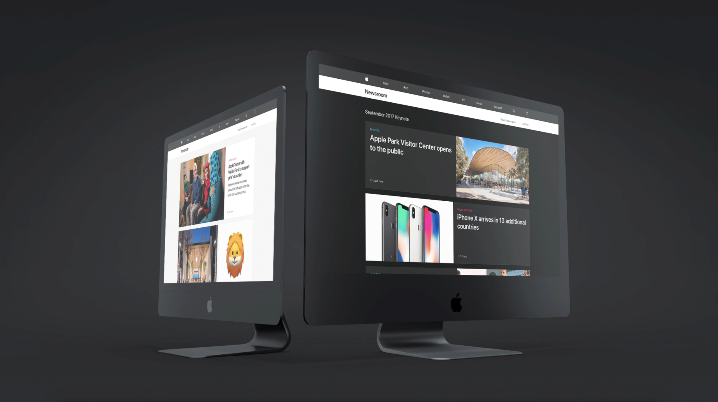
There were two designers on the redesign. We each pitched a direction. The enclosed work is my direction which was ultimately selected by Apple.
Newsroom is Apple's primary destination for journalists to share news about the company. I was tasked to redesign the landing page and newsfeed from concept to interaction and pitch as well as the ultimate implementation.
Goals
Inspiration
Brainstorm
Solution
Takeover experience
Goals and audit
User needs & subsequent redesign goals
Below are the key goals for the redesign of Newsroom, briefed to the design team via Apple.
Promote the latest news and create content density + visual heirarchy.
Design for international languages, minimize the number of crops.
Implement design decisions that meet accessibility standards.
Audit of competitive landscape
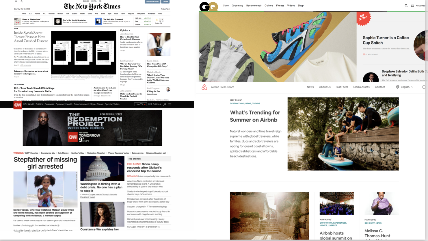

Ultimate inspiration
I was feeling like I was hitting a wall on how to solve for all the Newsroom asks. I took a break and went to SFMOM one week. I became inspired by Mondrian ultimately. I began to think about how the Newsroom articles could be “tiles” that scale up and down elegantly to fill in a landing page “canvas”.
Ideation
I ran through 100s of sketches and began to flush our this “Mondrian” river feed for the newsroom landing page.

From there, I prototyped the concept of the tiles scaling up and down to fit into their respective rows.
Strategy
I defined the key rows available in river feed. I used a 16:9 and 5:4 ratio at different scales. This would minimize the amount of crops for the content manager as well.
Rescaling tile options
The Mondrian River Feed
The Takeover Experience
Role: Designer
Organization: Elephant
Completion Date: 2019
Apple requested a unique landing page experience for Apple Special Events called the Takeover Experience. A last minute ask due to the success of the everyday feed. All interactions were also built by me.
Visual solve: dark mode for special events
In order to provide more visual control and highlight the first few special event articles, I designed the series as templates.

I created rules for engineering to implement these templates
Alternate Hero Tiles
After Hero Tiles, flow from largest rows to smallest rows
For scenarios 8-11: If even number of stories (x): x= (x-1) + 1 Hero
For scenarios 8-11: If odd number of stories (y): y= (y-2) + two column
Success metric
A key success metric for this site was that Newsroom continues to use the Mondrain river feed UX to this day. Marcom also adopted this pattern as a key pattern for their other websites. Companies externally did too like IDEO.
